01 / UX & Product Design
POW!
A wellness app for office workers
A mobile wellness concept that helps people with sedentary office routines notice their mood, take a short movement break, and build a more balanced rhythm across the workday.
Design question
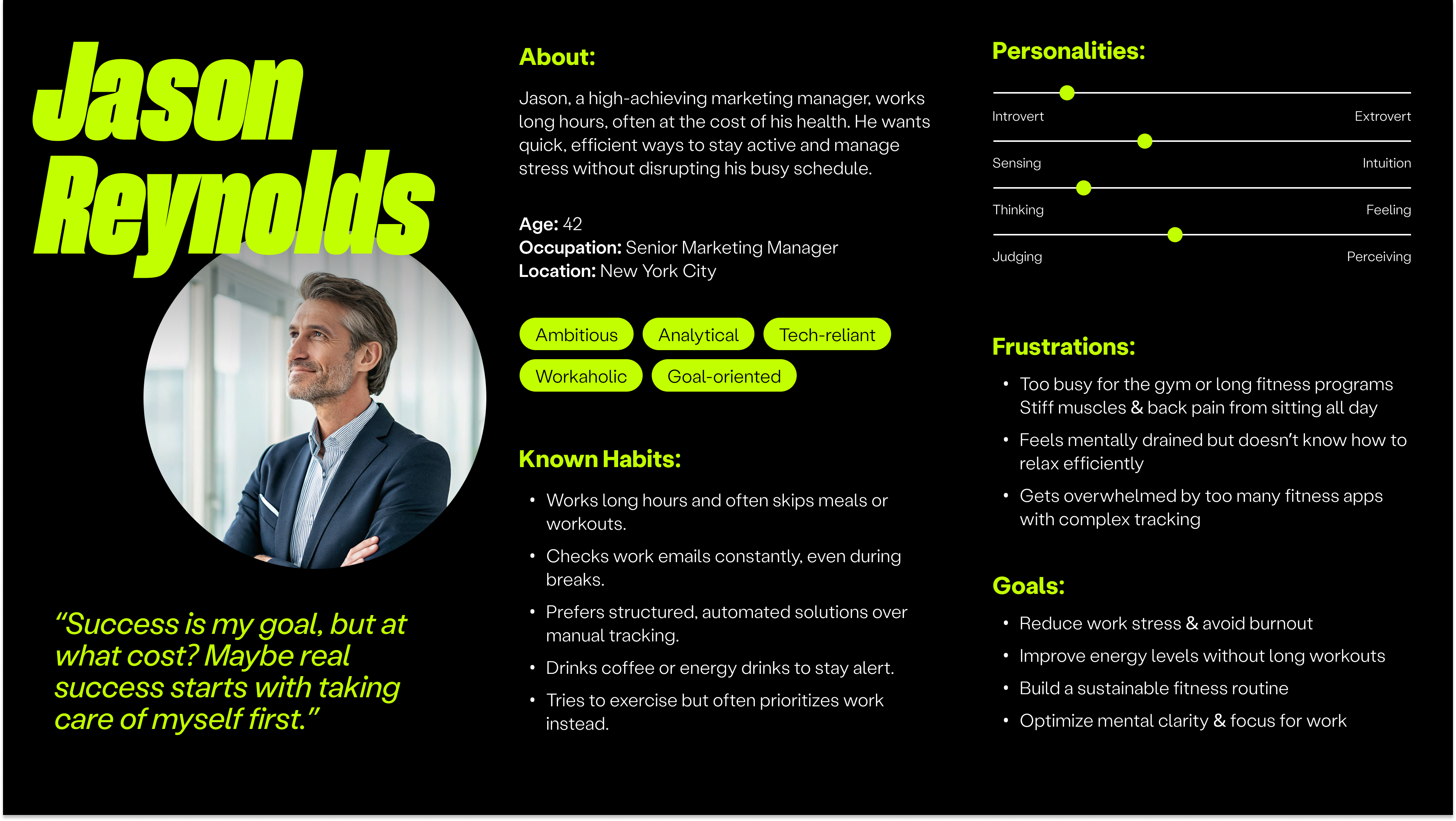
How might movement feel approachable to people who are busy, sedentary, or too drained to begin a conventional workout?
01 / Context
Wellness has to fit inside the workday
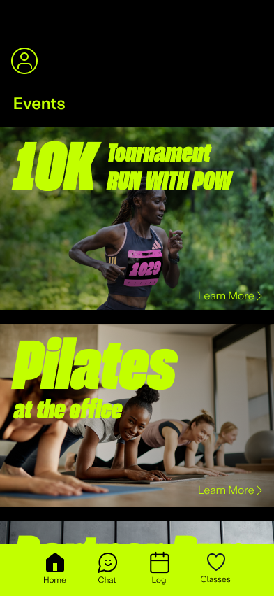
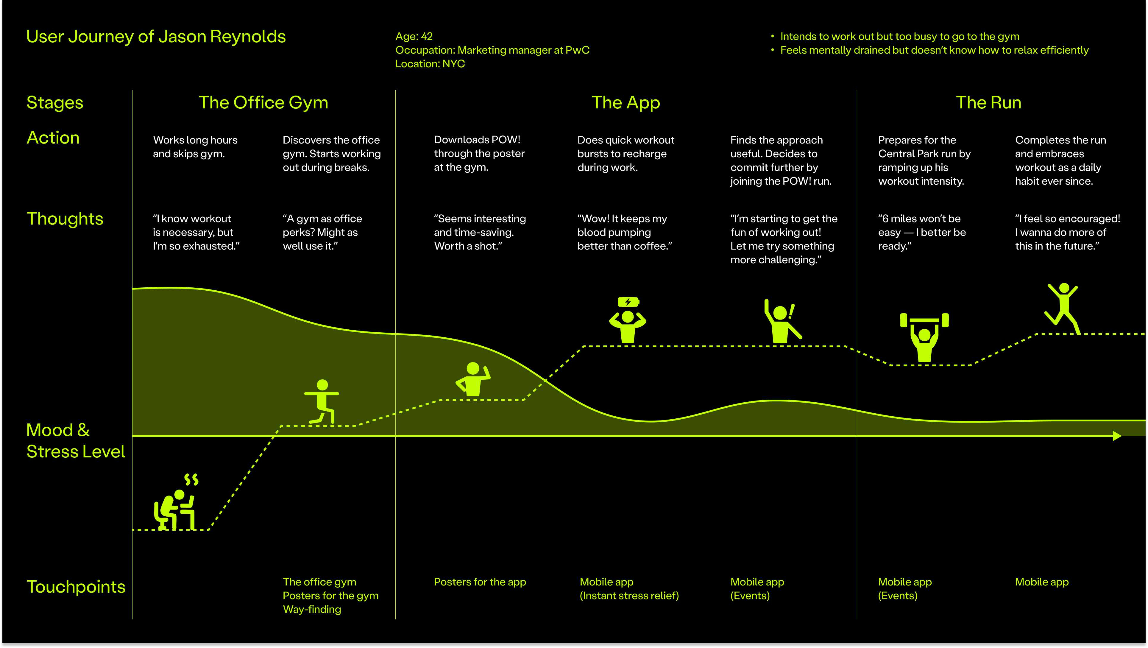
The team focused on office workers whose schedules make exercise easy to postpone. Rather than treating wellness as a separate performance goal, POW! places small movement prompts and emotional check-ins inside an existing daily rhythm.
Early ideation, audience definition, and product direction were developed collaboratively by the three-person team.
02 / Product structure
A simple loop from feeling to action
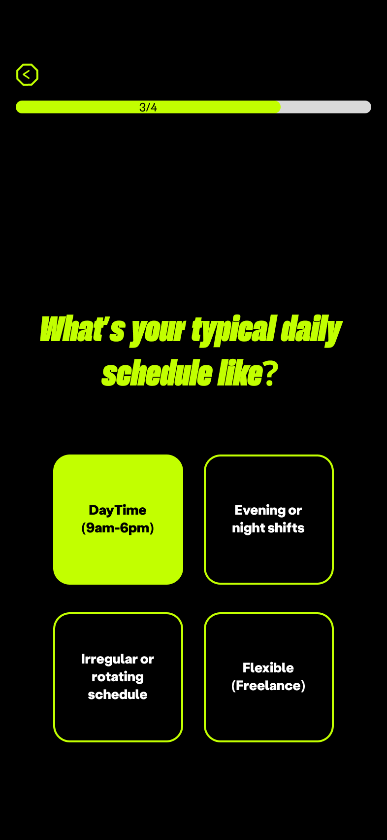
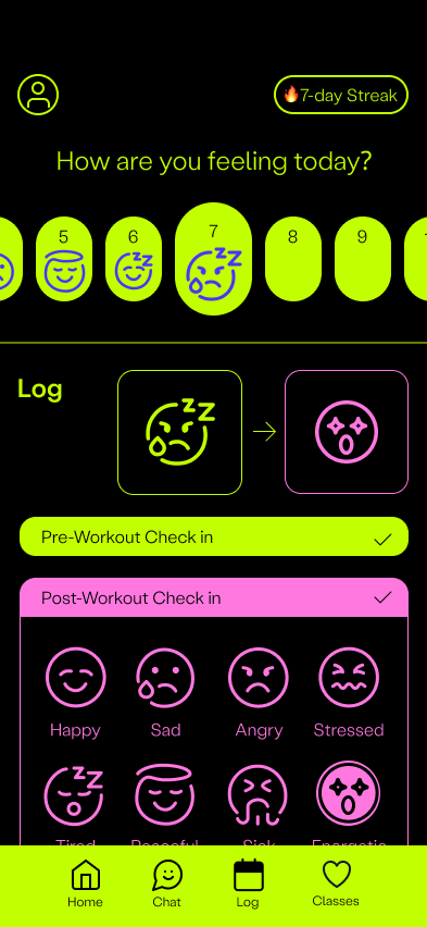
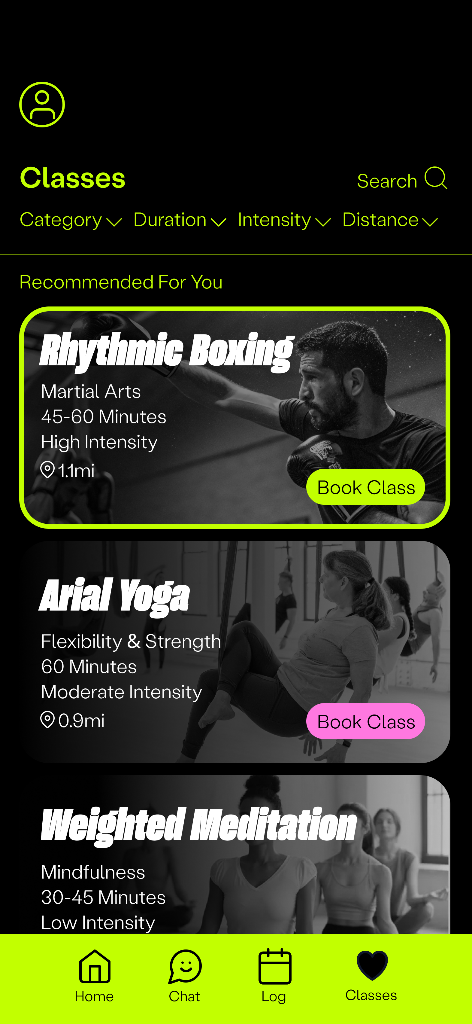
Users can record how they feel before and after movement, discover short exercises, join a class, or choose an immediate guided action such as box breathing. The product links emotional awareness with achievable physical activity.
The site map organizes onboarding, mood logging, classes, events, and saved progress around this repeatable loop.

03 / My contribution
Making progress visible without pressure
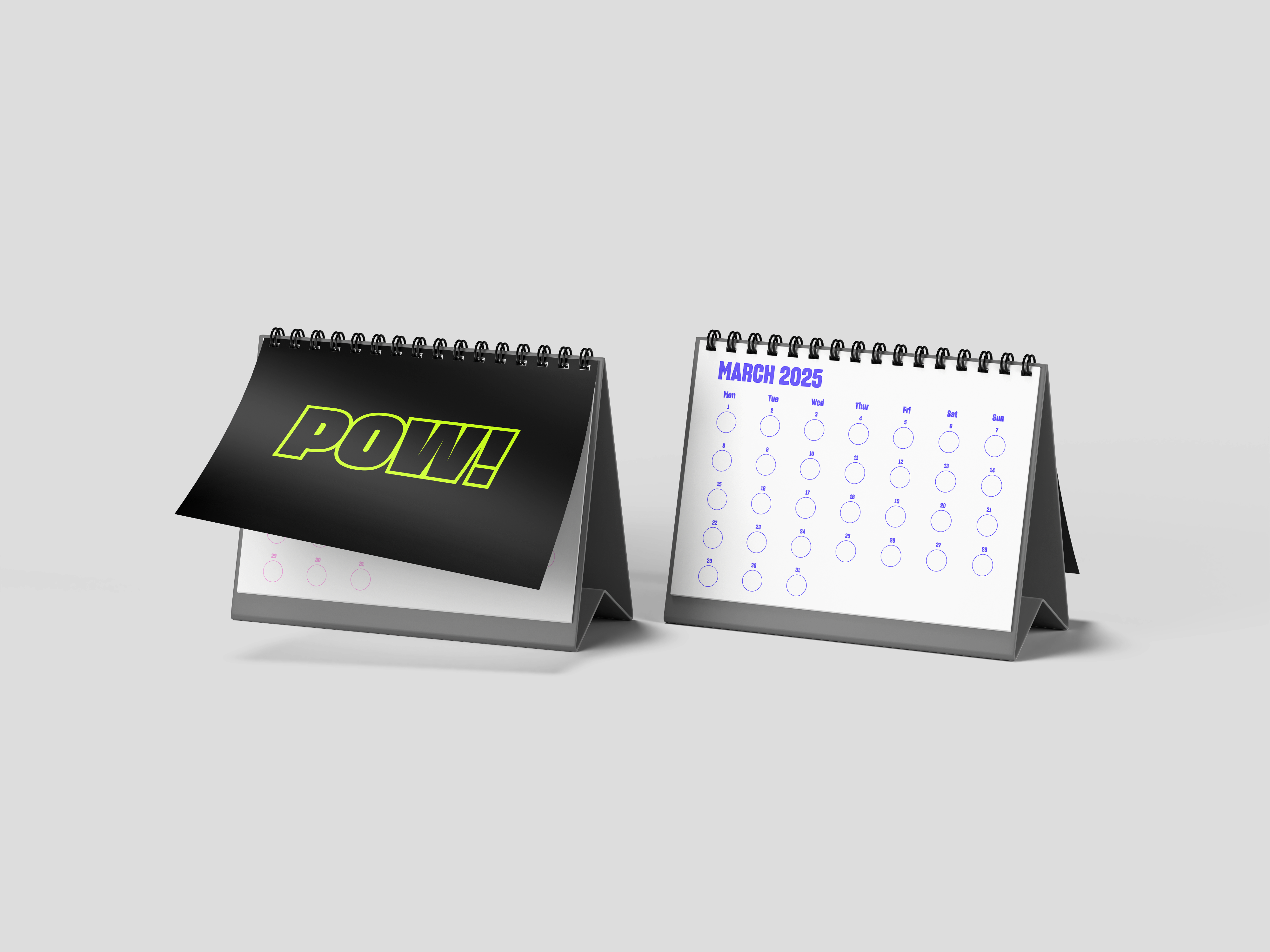
I designed the calendar, sticker system, and the emoji language used before and after workouts. These elements give users a lightweight way to recognize patterns without turning every activity into a performance score.
The visual system carries the same direct, energetic language across mood logging, instant actions, class discovery, and physical calendar touchpoints.
04 / Reflection
A team concept with clear individual ownership
POW! shows how a bold visual identity can support a low-pressure wellness experience. In a future iteration, I would simplify the relationship between events, classes, quick actions, and the calendar, then test whether users understand that structure during a real workday.
